Delay the appearance of loading spinners with CSS

Web apps should provide a visual indicator when content is being loaded. But sometimes this content is loaded very quickly, causing loading spinners to flash in and out. Which isn’t very useful or visually appealing. We could improve the user experience by not displaying the spinner at all in these cases. This also improves the perceived performance of the application. A simple way to achieve this is to introduce a slight delay before displaying the loading spinners.
Spinner CSS
Let’s create a loading spinner with a single <div> element and some CSS:
.spinner {
  display: inline-block;
  width: 24px;
  height: 24px;
  border-color: currentColor;
  border-style: solid;
  border-radius: 99999px;
  border-width: 2px;
  border-left-color: transparent;
  color: palevioletred;
}

@keyframes rotate {
  0% {
    transform: rotate(0deg);
  }
  100% {
    transform: rotate(360deg);
  }
}
Now to delay the appearance of the spinner, we’ll add another animation to our spinner. We want it to fade in after a short amount of time. We want the delay to be barely noticeable. We’ll go with 400 milliseconds.
You can define multiple animations by specifying multiple comma-separated values on an animation-* property. They will be assigned to the animations specified in the animation-name property. Add the following styles to your spinner CSS:
.spinner {
  /* previous styles omitted */

  opacity: 0;
  animation-name: rotate, fadeIn;
  animation-duration: 450ms, 600ms;
  animation-timing-function: linear, ease;
  animation-iteration-count: infinite, 1;
  animation-delay: 400ms;
}

@keyframes fadeIn {
  0% {
    opacity: 0;
  }
  100% {
    opacity: 1;
  }
}
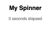
You will now notice that our spinner fades in after the delay, but it then disappears again as soon as it fades in. Pictured below:

After the fade in animation finishes the opacity value is reset back to the initial value of 0. We can fix this by using the animation-fill-mode CSS property. This property sets how a CSS animation applies styles to the target element before and after its execution. We want to set the value of this property to forwards. Which means, the target will retain the computed values set by the last keyframe of the animation. Lets update our spinner CSS by adding the following line:
.spinner {
  /* previous styles omitted */

  animation-fill-mode: forwards;
}
Now our animation works as expected! Pictured below:
Here’s the complete CSS:
.spinner {
  display: inline-block;
  width: 24px;
  height: 24px;
  border-color: currentColor;
  border-style: solid;
  border-radius: 99999px;
  border-width: 2px;
  border-left-color: transparent;
  color: palevioletred;
  opacity: 0;
  animation-name: rotate, fadeIn;
  animation-duration: 450ms, 600ms;
  animation-timing-function: linear, ease;
  animation-iteration-count: infinite, 1;
  animation-delay: 400ms;
  animation-fill-mode: forwards;
}

@keyframes rotate {
  0% {
    transform: rotate(0deg);
  }
  100% {
    transform: rotate(360deg);
  }
}

@keyframes fadeIn {
  0% {
    opacity: 0;
  }
  100% {
    opacity: 1;
  }
}
Wrapping up
This is a nice and simple way to improve the user experience when content is expected to load very quickly. But you may not always want to delay displaying your loading states. For React apps, the new Suspense for Data Fetching (currently experimental), will allow us to solve this problem elegantly when it is eventually released.