BetEasy.com.au Re-brand & Style Guide
The goal of re-branding beteasy.com.au, was to give the existing React based SPA a fresh UI with some new features. Two product teams were assigned to work on this task together. I was one of the senior software engineers. Each team included 6 to 8 software engineers, principal engineer, architect, product manager, senior product manager and delivery lead. Following the Agile methodology with sprint based planning.
As this was a greenfield project, we had the chance to update our tech stack. We moved from standard JavaScript to TypeScript. And from CSS Modules to CSS in JS with Emotion. Both of these choices required engineers to take part in some up-skilling. As well as setting new best practices within the engineering teams. A large, ongoing project with many teams working on it will benefit having type safety in the long run. The theme based styling helped improve UI consistency. Along with improving developer experience.
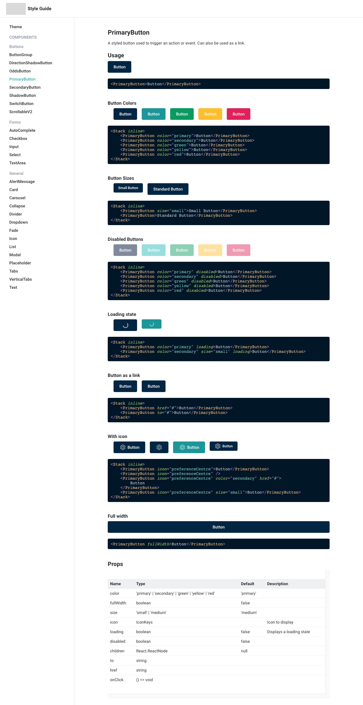
A pillar of this project was the style guide. Sometimes referred to as a component library or design system. I conceived and the style guide architecture. Which would serve as documentation for our reusable React components. Not only for the engineers, but all members of the team.
Deciding on the architecture was the first problem to solve. Should we build on top of an existing style guide framework. Like Styleguidist and StoryBook. Or develop a bespoke solution. Which would involve a bit more development time up front. But would provide us with greater flexibility in the future. To make an informed decision, I spent some time setting up quick examples for each.
There was a big downside of using one of the existing frameworks. They needed to have their own build process. This would either force us to try and get it working with our current build process. Making it much more complicated. Or we could maintain the style guide as a separate code base. This would be suitable if our style guide was for more than a single repository. But as this was not the case, this would only serve as a barrier to entry for engineers. They would have to be working within two codebases to update the style guide.
If it was too much effort to maintain, engineers may not have the time to do so. And if it's not up to date, it won't be useful. So I wanted to make the process of updating the style guide as straightforward as possible. Which is why I decided to go with the custom solution.
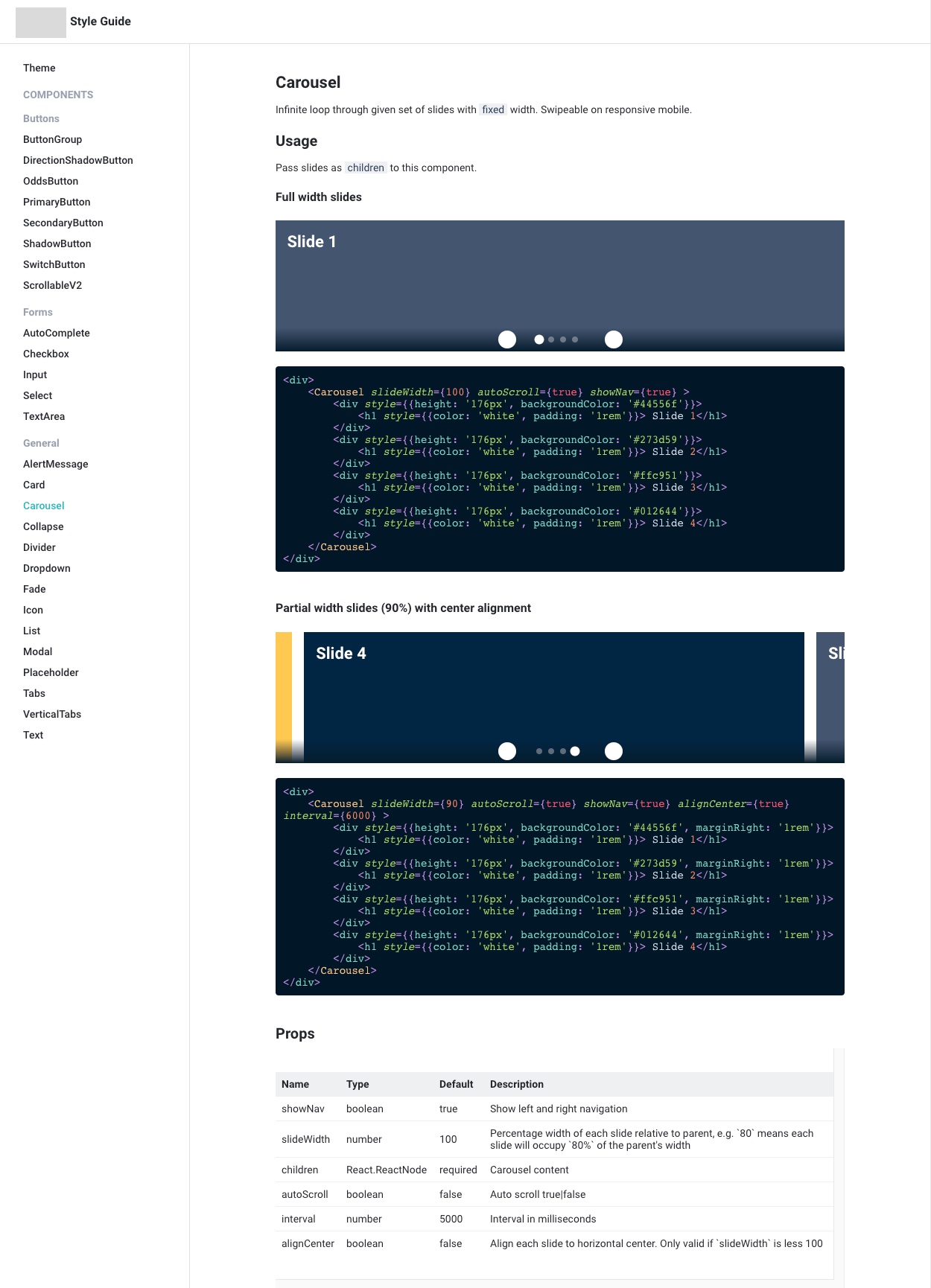
There are a few libraries that helped made a custom solution possible in a short amount of time. The first being MDX. This enables us to use React components in Markdown. And with a little bit of work it also allows us to render live editable code blocks. With customisable syntax highlighting. Couple this with react-docgen for generating our component props documentation. And we have the building blocks of a good style guide.
The teams enjoyed working with a solution that fit into our project. After the initial launch, the teams were able to tweak the style guide to meet our needs.